The Data-Grid view is a read-only or editable grid that displays rows of records on the app views page from a single view data source instance you specify on the view design page. If it is editable, this view provides a design-time choice of three edit modes for editing the grid either one row one at a time or one page of rows at a time.
At run time, the grid initially displays by itself with no records selected, depending its edit mode. (For read-only mode, row selection in this grid has no built-in function except to highlight the selected row.) You can then navigate the rows of the grid a page at a time using a page selection control at the bottom of the grid. If the grid is editable, you can then edit the grid either one row at a time or multiple rows at a time on the current page, with a UI appropriate for the particular edit mode that is defined at design time
At design time, you can also customize what columns are displayed from the fields of the data source, as well as other properties that affect the display of the grid and its data. For example, you can enable design-time options to select the data source fields to display and edit in grid columns, modify the grid page size, filter the rows by column at run time, and sort the rows by column at run time.
This grid view provides the same basic capabilities that appear in grids displayed for other Data-Grid* views, some of which are read-only or editable, depending on the view and the grid that appears in the view. For example in Data-Grid* views with forms, the single grid is read-only and provides appropriate built-in behavior for displaying and optionally editing the columns of a single row in a form when you select the row. In the parent-child views, the parent grid is read-only and the child grid (or grids) can be defined as read-only or editable exactly like this Data-Grid view.
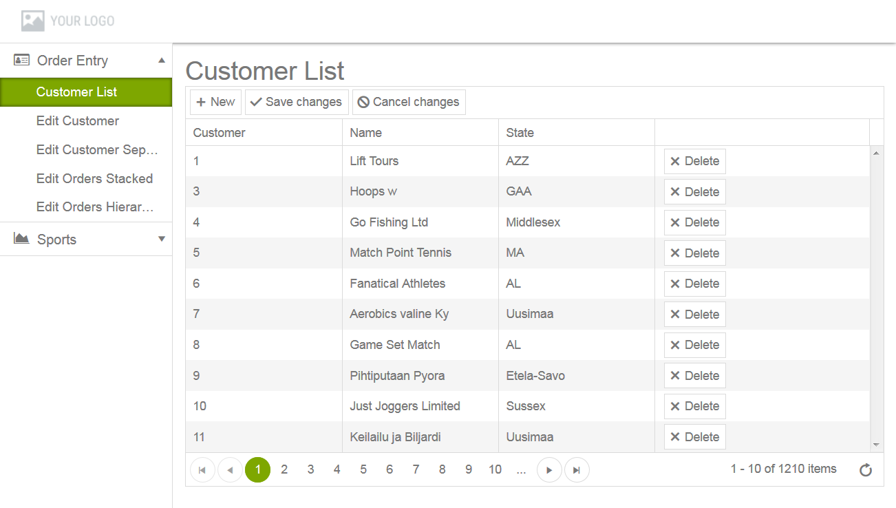
When you select an instance of this Data-Grid view in a module at run time, the app displays a page similar to the view labeled Customer List in this example:
Figure 14. Data-Grid view running in app
This particular view displays editable rows of records from its bound data source in a grid, showing field values for selected columns of each record. The rows are displayed in pages with a design-time specified size. You can navigate through the pages of the grid view by selecting the first, previous, specific, next or last page control.
In this case, the grid is defined with the Incell edit mode (described later in this section), which allows you to edit any and all writable columns in all rows displayed on the current page of the grid simply by clicking into a particular column on the page and modifying its contents. Buttons are also available to add and edit new rows (New), delete existing rows (Delete), and either save all changes (Save changes) or cancel all changes (Cancel changes) to the rows on the current page.
Note: For Incell edit mode to save changes for multiple rows at a time, the OpenEdge Data Object resource that underlies the data source bound to this view must be defined with a Submit operation to handle all write requests to the server. For more information, see the information on Submit operation support for Data Object Services in OpenEdge Development: Web Services and Progress Developer Studio for OpenEdge: Online Help. In addition, see OpenEdge Getting Started: New Information documentation that describes support for transactional Submit in OpenEdge 11.7 service packs.
If this view was defined with one of the other available modes for editing, selecting a row at run time allows you to edit the columns of the row, either directly within the selected row by clicking into the row's columns (Inline edit mode) or within a pop-up form that displays the columns of the row for editing using the editor type defined for each field (Popup edit mode). Corresponding buttons (not shown) are also displayed for each of these edit modes to add (New), edit (Edit), delete (Delete), and save (Update) or cancel (Cancel) changes to each row.
Note: Unlike the forms associated with the Data-Grid* views with forms, the pop-up form displayed for Popup edit mode does not support built-in look-ups using foreign key fields.
If this view was defined as read-only (ReadOnly edit mode), none of the editing buttons (such as New or Delete) are displayed, and selecting any single row highlights the row, but has no other default function.
To add a Data-Grid view to a user-created module, edit the module, which opens a view design page in the module (see Figure 16 for an example), then click Add View at the top of the VIEWS pane.
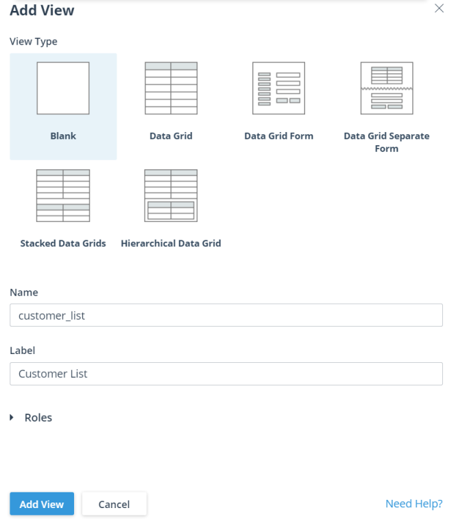
This opens an Add View dialog box, similar to this example:
Figure 15. Add View dialog box creating a Data-Grid view
In this example, the dialog box has customer_list entered as the value of the view Name, Customer List entered as the value of the view Label, and Data Grid selected as the View Type. Note that the Name value cannot contain spaces to separate its components (along with other restrictions) and can never be changed once you create the view; it identifies the view both in the Designer view design page and in internal code generated for the view. However, the Label value can contain spaces and can be changed at any time; it identifies the view in the app run-time layout. The view types listed in this dialog box (shown with a corresponding icon) identify the available built-in view templates you can use to add a user-created view.
The Rolestab opens an Authorization Roles dialog box that allows you to select the user roles that the app can use to authorize access to this view. To know more about roles, see Using roles to authorize user access.
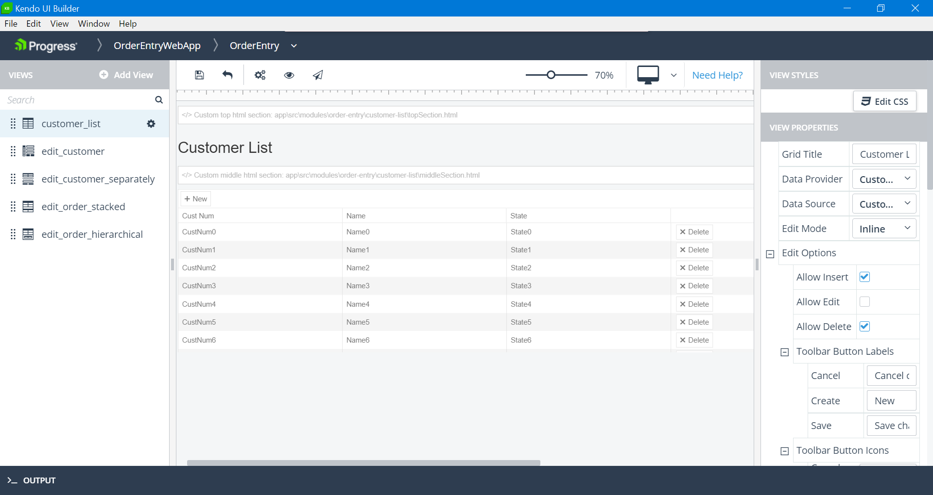
After specifying the Name, Label, and View Type, click Add View to create the specified view and display its view design page for editing, as shown for the customer_list Data-Grid view in this example:
Figure 16. Data-Grid view design page
The Data-Grid view design page shows certain features common to all predefined Data-Grid* view design pages, top-to-bottom and left-to-right:
Header — Similar to the header for the app design page, with the addition of breadcrumbs that track your path in the Designer to the current view design page.
Toolbar — Provides the following tools:
Save — Saves any unsaved changes in the current view definition to the UI meta-data.
Revert — Cancels any unsaved changes and returns the current view definition to its state as of the most recent Save.
Generate — Invokes the Kendo UI Generator to build the current state of the app ready for preview.
Preview — Either invokes the Kendo UI Generator to rebuild and preview the latest state of the app, or immediately preview the most recent generated build (if one exists). The preview opens in a tab of your default browser using a webpack-dev-server with live data from the data sources mapped to the app views.
Publish — Invokes the Kendo UI Generator to build a deployment version of the app either for testing (Debug) or production (Release) in their own respective locations. For more information on app builds, see App generation and deployment.
— Selects a device whose view you want to simulate in the view design page and which resembles the view as displayed on the physical device at run time. The displayed icon reflects the selected device from these supported devices: Desktop (default), Laptop, Tablet landscape, or Tablet portrait.
The run-time preview that you open from the Designer using Preview always displays according to the physical device where you are running the Designer.
VIEWS pane (in panel on the left) — Lists the views in the current module, including the example customer_list view. There is also an Add View button (used to create this view) for creating additional views and a search box for locating a view in a long list of views in the module.
View design panel (in the middle) — Shows a design simulation of the view, bounded on the left and top with a vertical and horizontal ruler. The view design panel contains the following elements that are common to all predefined Data-Grid* views, but which might contain different content for each predefined view type:
Custom top html section — Initially not implemented, this custom section appears in the view when you code the content of an HTML <div> element that displays at the top of the view.
Header section — In this case, an identifying title for the view (Grid Title setting shown below).
Custom middle html section — Initially not implemented, this custom section appears in the view when you code the content of an HTML <div> element that displays in the middle, between the header and data sections of the view.
Data section — In this case, showing a design simulation of the grid as currently configured in the example Data-Grid view instance for display.
Custom bottom html section — Initially not implemented, this custom section appears in the view when you code the content of an HTML <div> element that displays at the bottom of the view.
For more information on coding custom HTML sections, see Custom HTML sections in this document.
The design simulation in a view design panel changes as you modify some of the view properties that affect its appearance, and even as you click around in the simulated view design panel, depending on these property settings. For example, the customer_list view grid title is set to Customer List using the Grid Title property and there are ten (10.00) rows on each page of the grid as set for the Page Size property (see the VIEW PROPERTIES pane description, below, for more information).
The VIEW STYLESpane (in panel on the right) — provides an Edit CSS button that enables you to add and edit CSS styles for the view. Clicking the Edit CSS button opens the view's style.css file in a Monaco editor. The style.cssfile is located in application-folder\app\src\modules\module-folder\view-folder, where application-folder is the path to the folder that contains and is named for your web app, module-folder is the name of the folder defining the module, and view-folder is the name of the folder defining the view.
Note: To apply CSS classes (defined in the style.css file) to the view, you must specify the class names in the CSS Class List property in the VIEW PROPERTIES pane.
VIEW PROPERTIES pane (in panel on the right) — Contains all the properties that you can set that change the design-time appearance and content of the view, as well as some settings that can affect view behavior, such as view-specific event handler settings.
Figure 17. Data-Grid view properties
Additional properties and values of note include:
Data Provider and Data Source — Allow you to select an available data provider and data source instance to bind to the view. For more information, see Data providers and data sources.
Edit Mode — Allows you to define the grid as either read-only or editable using one of the following modes as described above: ReadOnly, Incell, Inline, or Popup.
Edit Options — For editable grids, these options allow you to customize the editing features available in the selected edit mode (whether adding new rows (Allow Insert), editing existing rows (Allow Edit), or deleting existing rows (Allow Delete) is allowed) and the labels for the buttons provided both in the editing toolbar (Toolbar Button Labels) and for each row (Row Button Labels), depending on the edit mode. The defaults for these options are shown.
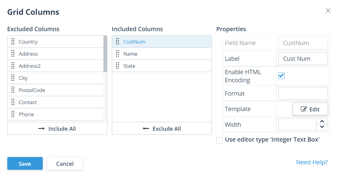
Grid Columns — Clicking Edit for this property opens a Grid Columns dialog box that allows you to specify what data source fields appear as columns in the grid, and some features affecting how each field is displayed in the grid:
Figure 18. Grid Columns dialog box
As shown in this example, three data source fields are specified in the Included Columns list for display as columns in the grid, CustNum, Name, and State. You can also change the order of the displayed columns by dragging-and-dropping fields within Included Columns. All fields not displayed as columns in the grid are moved to the Excluded Columns list. You can move these fields between lists individually using drag-and-drop or move all fields from one list to the other by clicking Include All or Exclude All
The current Properties apply to the field that you select in the Included Columns list, as shown for the CustNum field. Enable HTML Encoding specifies whether HTML coding included in the field value applies to the column's displayed value. Format allows you to specify a Kendo UI notation for adding additional text to the column value or changing the display format of the column value, depending on its field data type. See the Kendo UI documentation for more information, for example, Number Formatting. Template allows you to customize the display of a given column using a Kendo UI column template that you can specify. For more information, see Column templates in this document. Label allows you to specify or change the displayed column label. Width allows you to specify the initial column width in pixels; otherwise, the column width is responsive as needed. The Use editor type <editor name> property enables you to set a semantic type editor for the field. Kendo UI Designer assigns a default editor for every field based on the field's base data type or ABL data type. However, you can choose a semantic type editor instead by selecting this checkbox, which enables you to configure a few additional properties for the field.
Page Size — Specifies the number of rows to display in each page of the grid. (The last page can have fewer rows, depending on the total number of records in the data source.)
Row Template Function or Row Template Id — Specifies custom behavior for the display of every grid row. You can use one of these options to specify the behavior, but Row Template Id takes precedence if you specify both. You must write additional code to implement either one. Otherwise, the bound data source definition and the Grid Columns settings determine how each row is displayed.
Row Template Function specifies a JavaScript function that you write to return template-formatted results to display for each row; Row Template Id specifies the id of a <script> tag that contains the actual HTML code for the row template to use to display each row. For more information, see Row templates in this document.
Alt Row Template Function or Alt Row Template Id — Specifies custom behavior for the display of every other grid row. Otherwise, these properties work similar to Row Template Function and Row Template Id, respectively. If you do not specify either one, all rows of the grid are formatted according to Row Template Function or Row Template Id.
Enable * — Together with Page Size, these properties control the general presentation of data in the rows and columns of the grid, such as selecting a subset of the available data (Enable Column Filtering) and changing the order of rows (Enable Sorting) and columns (Enable Column Reordering).
The Page Size, Enable Column Filtering, and Enable Sorting property values can be managed either by Kendo UI in the client web app or by the Data Object resource that implements the bound data source on the server. The choice of what data management facility responds to these property settings depends on the capabilities of the Data Object resource and whether you select the Client-side Processing option as part of the definition for the bound data source. For more information on the Client-side Processing option, see Adding and editing a data source.
Events — Provides one or more properties to change the default name of the event handler function defined for each Data-Grid view-specific event:
Row Select Event Function — Default value: onRowSelect. Executes for the Row Select event, which fires when the selected row changes in the grid.
Row Create Event Function — Executes for the Row Create event, which fires before a row is created for a new data source record.
Row Update Event Function — Executes for the Row Update event, which fires before an existing data source record is updated in a row.
Row Delete Event Function —Executes for the Row Delete event, which fires before an existing data source record is deleted in a row.
You can also use properties in the Edit View dialog box to change the default names of event handler functions for general events that apply to all views. You can access this dialog by clicking the drop-down menu for each view (as shown for the example customer_list view listed in the VIEWS pane), then clicking the Edit option.
Caution: You must ensure that any change to the default name of an event handler function that you make using its view property you also make to the name of the actual JavaScript function in source code.
You must add custom code to each view event handler function in order to implement any useful behavior for it. The default behavior of these functions has no functional effect. Typically, you do not need to change the default names of event handler functions. However, the view properties exist to allow this name change if you have the need (for example, to avoid a naming conflict with existing JavaScript code you are using elsewhere in the app). For more information on coding both view-specific and general event handler functions (and changing their names in the source), see General view events and View-specific events in this document.
 Header — Similar to the header for the app design page, with the addition of breadcrumbs that track your path in the Designer to the current view design page.
 — Selects a device whose view you want to simulate in the view design page and which resembles the view as displayed on the physical device at run time. The displayed icon reflects the selected device from these supported devices: Desktop (default), Laptop, Tablet landscape, or Tablet portrait.
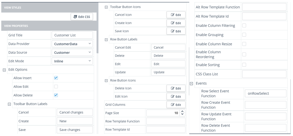
 drop-down menu for each view (as shown for the example customer_list view listed in the VIEWS pane), then clicking the Edit option.