Data-Grid-Separate-Form view is a read-only grid that offers a design-time choice of three edit modes using a form a read-only, directly editable, or read-only-to-edit form that overlays the grid in a separate screen on the app views page.
At run time, the grid initially displays by itself with no records selected. You can then navigate the rows of the grid without selecting a record. At any point during row navigation, you have the choice of selecting a row in the grid, or if the associated form is directly editable or read-only-to-edit, selecting an option to add a new record to the bound data source.
For a read-only or read-only-to-edit form, selecting a grid row automatically overlays the grid with a read-only form showing fields from the record displayed as read-only, plain text. These fields can be organized into field groups that appear in labeled tabs within the form. For a read-only-to-edit form, you also have the option to edit the record displayed in the read-only form or go back to the grid without making changes.
For a directly editable form, selecting a grid row overlays the grid with a form that displays the record fields for editing according to the editor types selected for the fields in the data source. These fields can be organized into field groups that appear in labeled tabs within the form. For a read-only-to-edit form, an identical editable form also overlays the initial read-only form when you select the option to edit the displayed record. This editable form provides options to save or cancel the changes you make, or to delete the record from the data source that is selected in the grid and displayed in the form.
If you select the grid option to add a new record, the view overlays the grid with a similarly editable form that displays the fields for a new record with initial values that you can change before adding the record to the data source.
For any editable form, you can either save the changes or cancel the changes. For a read-only-to-edit form that is editing an existing record, the screen returns to the read-only form displaying the same record fields, with an option to go back to the grid. For a directly editable form, the screen goes directly back to the grid. For either edit mode, when the screen goes back to the grid, it either displays with the row highlighted (but not selected) for the most recently edited or added record, or displays with the first row highlighted in the current grid page after canceling a new record add.
At design time, you can separately customize what columns are displayed in the grid and what fields are displayed on the form, as well as other properties that affect the display of the grid, the form, and its data.
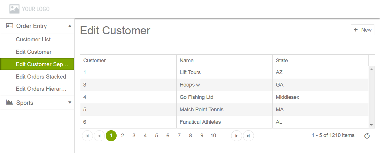
When you select a Data-Grid-Separate-Form view in a module at run time, the app displays a page similar to the view labeled Edit Customer Separately in this read-only-to-edit mode example:
Figure 25. Data-Grid-Separate-Form view running in app
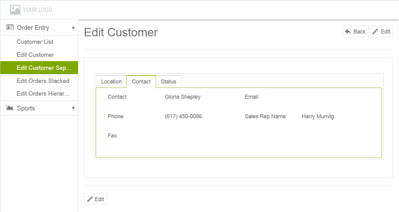
Selecting any row, on any page of the grid immediately overlays the grid with a read-only form containing fields displayed from the bound data source record shown in that row, as in this example, shown with three field groups accessible using a tab folder:
Note: Clicking New (above the grid) overlays the grid with an editable form for adding a new record to the bound data source, which is not shown.
Figure 26. Data-Grid-Separate-Form view running in app with read-only form overlaying the grid
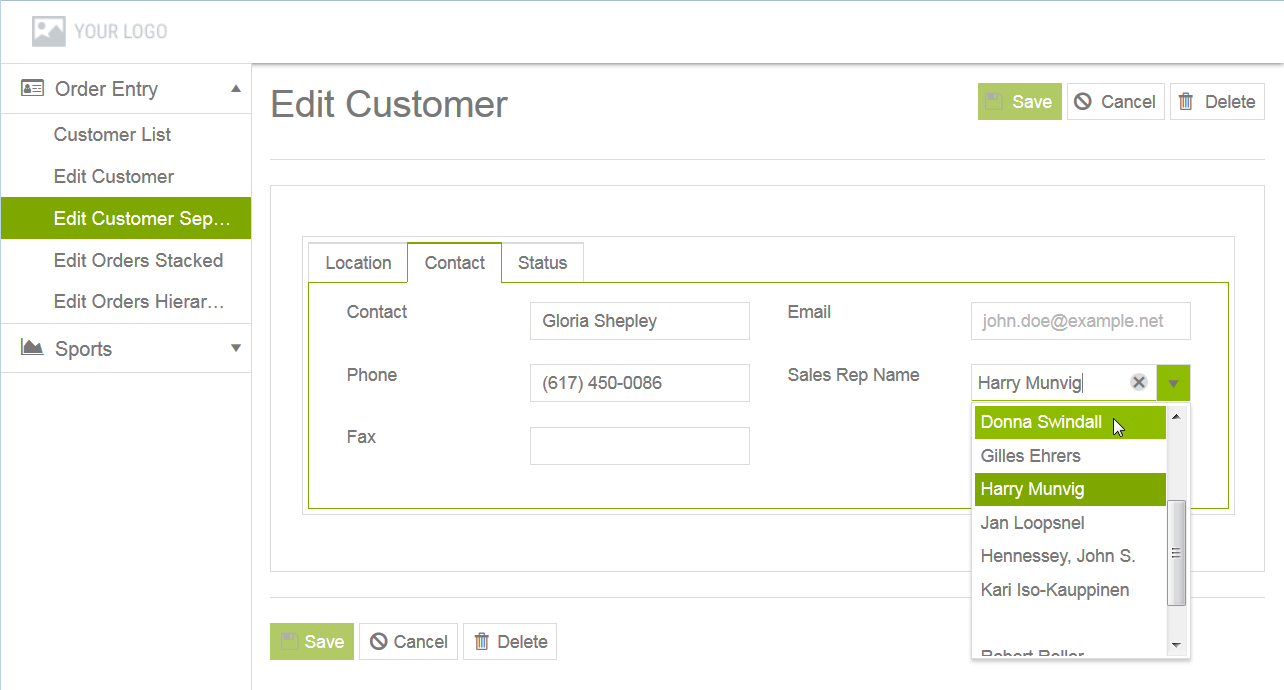
Clicking Back (above the form) returns to the read-only grid with the same row highlighted; clicking Edit (above or below the form) overlays the read-only form with an editable form, as in the following example:
Figure 27. Data-Grid-Separate-Form view running in app with editable form overlaying the read-only form
Each field in the editable form is displayed according to the editor type that has been selected for it in the bound data source. In this example, the displayed value of the form field labeled Sales Rep Name can be changed by selecting a new value from a list (combo-box editor type) that is populated from a foreign key look up. The Kendo UI Builder provides built-in support for foreign key look ups in the forms of Data-Grid* views with forms. For more information on foreign key support, as well as selecting editor types for fields, see Adding and editing a data source.
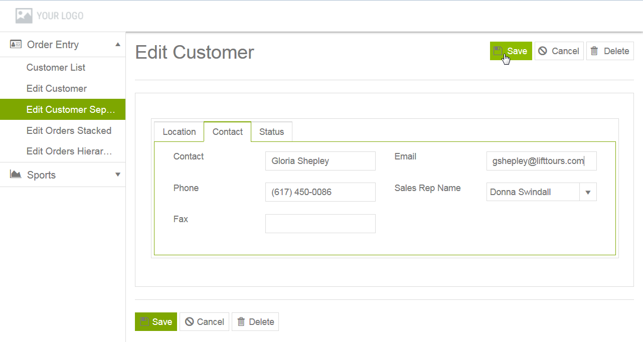
This is the editable form after saving changes to the Email and Sales Rep Name fields:
Figure 28. Data-Grid-Separate-Form view running in app with editable form changes
From here, the edited record can be saved (by clicking Save), deleted (by clicking Delete), or the edit canceled (by clicking Cancel), all of which return to the read-only form displaying fields from an appropriate record, with the grid enabled.
Note: For a Data-Grid-Separate-Form view running in edit (as opposed to read-only-to-edit) mode, no read-only form is ever displayed. Instead, only an editable form is displayed for a selected row, and selecting any button (Save, Delete, or Cancel) completes the specified function and returns to the read-only grid with an appropriate row highlighted.
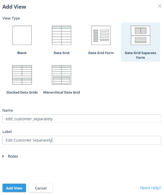
To add a Data-Grid-Separate-Form view to a user-created module, edit the module, which opens a view design page in the module (see Figure 30 for an example), then click Add View at the top of the VIEWS pane.
This opens an Add View dialog box, similar to this example:
Figure 29. Add View dialog box creating a Data-Grid-Separate-Form view
In this example, the dialog box has edit_customer_separately entered as the value of the view Name, Edit Customer Separately entered as the value of the view Label, and Data Grid Separate Form selected as the view type. The options for entering these values are the same for all user-created views.
The Rolestab opens an Authorization Roles dialog box that allows you to select the user roles that the app can use to authorize access to this view. To know more about roles, see Using roles to authorize user access.
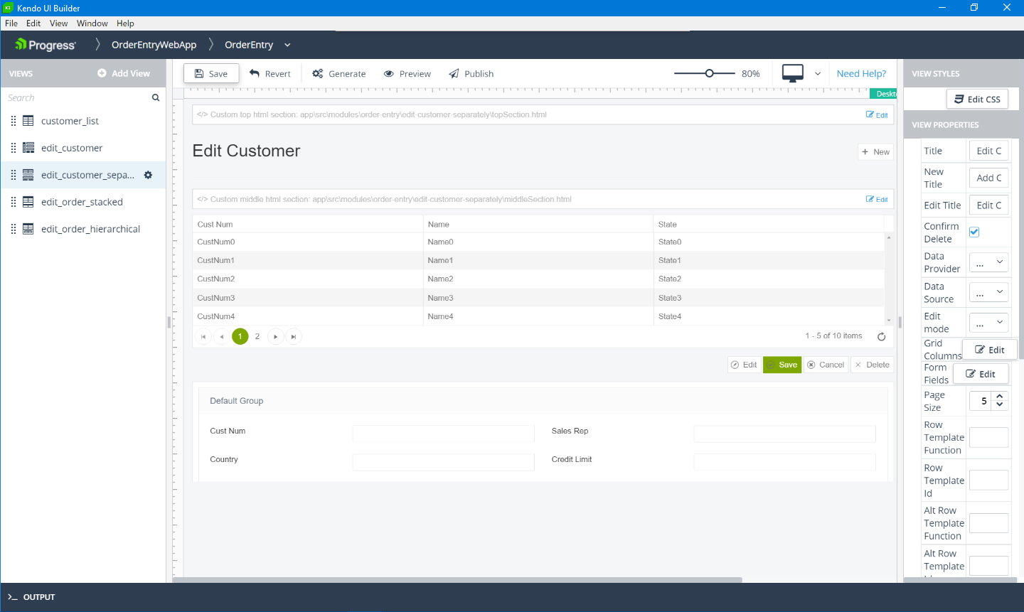
After specifying the Name, Label, and View Type, click Add View to create the specified view and display its view design page for editing, as shown for the edit_customer_separately Data-Grid-Separate-Form view in this example:
The Data-Grid-Separate-Form view design page shows certain features common to all predefined Data-Grid* view design pages, top-to-bottom and left-to-right:
Header — Similar to the header for the app design page, with the addition of breadcrumbs that track your path in the Designer to the current view design page.
Toolbar — Provides the following tools:
Save — Saves any unsaved changes in the current view definition to the UI meta-data.
Revert — Cancels any unsaved changes and returns the current view definition to its state as of the most recent Save.
Generate — Invokes the Kendo UI Generator to build the current state of the app ready for preview.
Preview — Either invokes the Kendo UI Generator to rebuild and preview the latest state of the app, or immediately preview the most recent generated build (if one exists). The preview opens in a tab of your default browser using a webpack-dev-server with live data from the data sources mapped to the app views.
Publish — Invokes the Kendo UI Generator to build a deployment version of the app either for testing (Debug) or production (Release) in their own respective locations. For more information on app builds, see App generation and deployment.
— Selects a device whose view you want to simulate in the view design page and which resembles the view as displayed on the physical device at run time. The displayed icon reflects the selected device from these supported devices: Desktop (default), Laptop, Tablet landscape, or Tablet portrait.
The run-time preview that you open from the Designer using Preview always displays according to the physical device where you are running the Designer.
VIEWS pane (in panel on the left) — Lists the views in the current module, including the example edit_customer_separately view. There is also an Add View button (used to create this view) for creating additional views and a search box for locating a view in a long list of views in the module.
View design panel (in the middle) — Shows a design simulation of the view, bounded on the left and top with a vertical and horizontal ruler. The view design panel contains the following elements that are common to all predefined Data-Grid* views, but which might contain different content for each predefined view type:
Custom top html section — Initially not implemented, this custom section appears in the view when you code the content of an HTML <div> element that displays at the top of the view.
Header section — In this case, an identifying title for the view (Title setting).
Custom middle html section — Initially not implemented, this custom section appears in the view when you code the content of an HTML <div> element that displays in the middle, between the header and data sections of the view.
Data section — In this case, showing a design simulation of the grid and separate form as currently configured in the example Data-Grid-Separate-Form view instance for display. Note that this includes a simulation of the button configuration for the view, including the New button above the grid, as well as the Edit, Save, Cancel, and Delete buttons that appear above and below either a read-only or editable form, depending on the edit mode selected for the view (each form style has a subset of these buttons at run time)
Custom bottom html section — Initially not implemented, this custom section appears in the view when you code the content of an HTML <div> element that displays at the bottom of the view.
For more information on coding custom HTML sections, see Custom HTML sections in this document.
The design simulation in a view design panel changes as you modify some of the view properties that affect its appearance, and even as you click around in the simulated view design panel, depending on these property settings. For example, the edit_customer_separately view title is set to Edit Customer Separately using the Title property, there are five (5.00) rows on each page of the grid as set for the Page Size property, and the buttons available with the read-only and editable forms are shown for the Read-Only-to-Edit setting of the Edit mode property (see the VIEW PROPERTIES pane description, below, for more information).
The VIEW STYLESpane (in panel on the right) — provides an Edit CSS button that enables you to add and edit CSS styles for the view. Clicking the Edit CSS button opens the view's style.css file in a Monaco editor. The style.cssfile is located in application-folder\app\src\modules\module-folder\view-folder, where application-folder is the path to the folder that contains and is named for your web app, module-folder is the name of the folder defining the module, and view-folder is the name of the folder defining the view.
Note: To apply CSS classes (defined in the style.css file) to the view, you must specify the class names in the CSS Class List property in the VIEW PROPERTIES pane.
VIEW PROPERTIES pane (in panel on the right) — Contains all the properties that you can set that change the design-time appearance and content of the view, as well as some settings that can affect view behavior, such as view-specific event handler settings.
New Title and Edit Title — Allow you to enter separate titles for an editable form displayed for adding a new record and an editable form displayed for editing an existing record, when clicking New and Edit, respectively, above the grid and on the read-only form (depending on the edit mode).
Data Provider and Data Source — Allow you to select an available data provider and data source to bind to the view. For more information, see Data providers and data sources.
Edit mode — Allows you to select Read-Only, Edit, or Read-Only-to-Edit. With Read-Only selected, the grid has no New button and only a read-only form is displayed with no Edit button, since no editable form is available. With Edit selected, the grid has a New button and only an editable form is displayed with appropriate buttons for editing either an existing selected record (Save, Cancel, Delete) or a new record (Save, Cancel).
Grid Columns — Clicking Edit for this property opens a Grid Columns dialog box that allows you to specify what data source fields appear as columns in the grid, and some features affecting how each field is displayed in the grid. This dialog box works the same for all Data-Grid* views. For more information, see the Grid Columns dialog box description in Adding and editing a Data-Grid view.
Form Fields — Clicking Edit for this property opens a Form Fields dialog box that allows you to specify what data source fields appear as fields on a form, and some features affecting how each field is displayed in the form. This dialog box works the same for all Data-Grid* views with forms. For more information, see the Form Fields dialog box description in Adding and editing a Data-Grid-Form view.
Page Size through Enable * — Together, these properties control the general presentation of data in the rows and columns of the grid and work the same for all Data-Grid* views. For more information, see the description of these properties in Adding and editing a Data-Grid view.
Events — Provides one or more properties to change the default name of the event handler function defined for each Data-Grid view-specific event:
Row Select Event Function — Default value: onRowSelect. Executes for the Row Select event, which fires when the selected row changes in the grid.
Data Bound Event Function — Executes for the Data Bound event, which fires when the view is bound to its data source.
You can also use properties in the Edit View dialog box to change the default names of event handler functions for general events that apply to all views. You can access this dialog by clicking the drop-down menu for each view (as shown for the example edit_customer_separately view listed in the VIEWS pane), then clicking the Edit option.
Caution: You must ensure that any change to the default name of an event handler function that you make using its view property you also make to the name of the actual JavaScript function in source code.
You must add custom code to each view event handler function in order to implement any useful behavior for it. The default behavior of these functions has no functional effect. Typically, you do not need to change the default names of event handler functions. However, the view properties exist to allow this name change if you have the need (for example, to avoid a naming conflict with existing JavaScript code you are using elsewhere in the app). For more information on coding both view-specific and general event handler functions (and changing their names in the source), see General view events and View-specific events in this document.
 Header — Similar to the header for the app design page, with the addition of breadcrumbs that track your path in the Designer to the current view design page.
 — Selects a device whose view you want to simulate in the view design page and which resembles the view as displayed on the physical device at run time. The displayed icon reflects the selected device from these supported devices: Desktop (default), Laptop, Tablet landscape, or Tablet portrait.
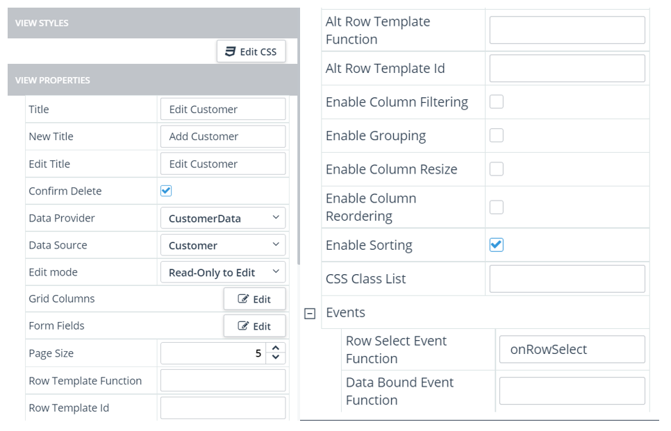
 drop-down menu for each view (as shown for the example edit_customer_separately view listed in the VIEWS pane), then clicking the Edit option.