 Layout components (rows and columns)Layout components (rows and columns)Data management components (e.g., Grid)Editor components (e.g., Text Box)Chart components (e.g., Bar Charts)Scheduling components (e.g., Calendar)Navigation components (e.g., Toolbar)Media Components (e.g., Images)Custom HTML components that you define
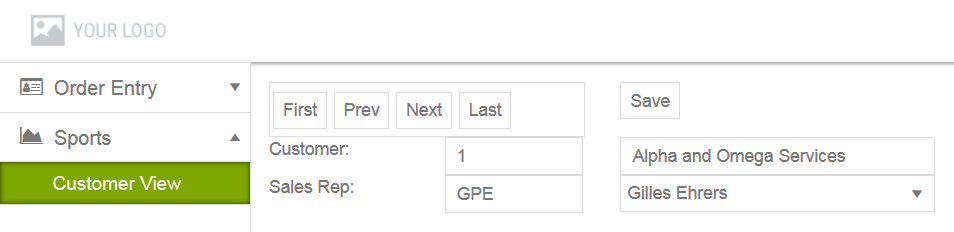
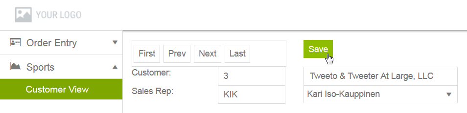
 Header — Similar to the header for the app design page, with the addition of breadcrumbs that track your path in the Designer to the current view design page.Toolbar — Provides the following tools:Save — Saves any unsaved changes in the current view definition to the UI meta-data.Revert — Cancels any unsaved changes and returns the current view definition to its state as of the most recent Save.Generate — Invokes the Kendo UI Generator to build the current state of the app ready for preview.Preview — Either invokes the Kendo UI Generator to rebuild and preview the latest state of the app, or immediately preview the most recent generated build (if one exists). The preview opens in a tab of your default browser using a webpack-dev-server with live data from the data sources mapped to the app views.Publish — Invokes the Kendo UI Generator to build a deployment version of the app either for testing (Debug) or production (Release) in their own respective locations. For more information on app builds, see App generation and deployment.
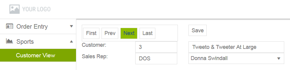
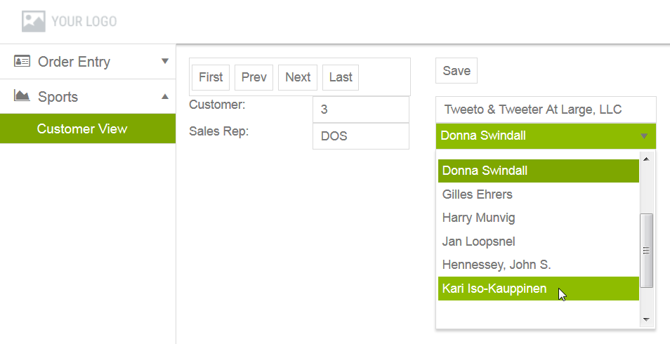
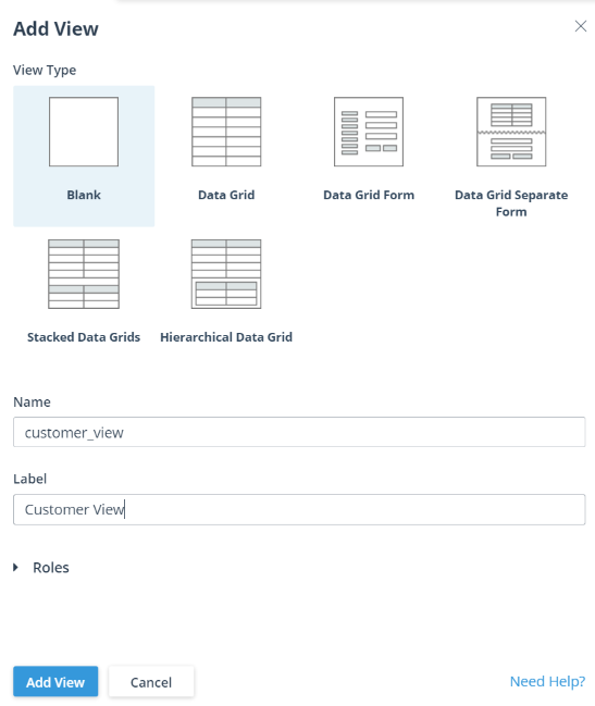
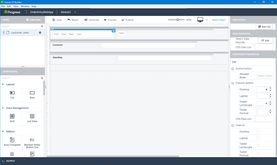
 — Selects a device whose view you want to simulate in the view design page and which resembles the view as displayed on the physical device at run time. The displayed icon reflects the selected device from these supported devices: Desktop (default), Laptop, Tablet landscape, or Tablet portrait.VIEWS pane (in panel on the left) — Lists the views in the current module, including the example customer_view view. There is also an Add View button (used to create this view) for creating additional views and a search box for locating a view in a long list of views in the module.COMPONENTS pane (in panel on the left) — Lists the supported layout and content components that you can drag-and-drop into a Blank view, including the following component categories:Layout — Including Col and Row for adding layout columns and rows, respectively.Data Management — Content components that bind to a data source and support both navigation through its records and editing of the fields of selected records, for example, a Grid or List View.Editors — Content components that bind to a single field of a selected record based typically on the field's semantic type, and that either support editing of the field (for example, a Text Box) or prevent editing of the field (for example, a Disabled Text Box), or that support no data binding, but provide labels for other content components (for example, a Label). Editors support the largest variety of content components for field values of various types.Charts — Content components that bind to and chart data points for a single data source instance based on one or more fields along a value axis and a single field along a category axis (or the equivalent, depending on the chart type). Supported charts include area, bar, donut, line, and pie charts.Scheduling — Content components that bind to and provide a graphical representation for scheduling data (for example, a Calendar).Navigation — Content components that provide no data binding, but that support fully customizable navigation through data, UI, other functional elements of an app (for example a Toolbar or Button).Media — Content components that enable you to add images in BMP, JPG, GIF, and PNG format.Custom — Content components that support customizable content (for example, Custom Html, which allows you to enter a single <div> element).View design panel (in the middle) — Shows a design simulation of the view, bounded on the left and top with a vertical and horizontal ruler. The Blank view design panel initially contains a single Row component containing two empty Col components (a single layout row with two empty columns).Three layout rows — With two columns in the first row and three columns in each of the next two rows.In the first row — A Toolbar configured with four buttons for CustomerDS data source navigation in the first column and a separate Button (with the text Save) in the second column.In the second row — A Label with the text Customer: in the first column, a Disabled Text Box in the second column for displaying the read-only value of the CustNum field from the current record in the CustomerDS data source, and a Text Box in the third column for displaying and editing the value of the Name field in the current record of the CustomerDS data source.In the third row — A Label with the text Sales Rep: in the first column, a Disabled Text Box in the second column for displaying the read-only value of the SalesRep field from the current record in the CustomerDS data source (custom coded as a foreign key to the SalesrepDS data source), and a Drop Down List in the third column for displaying the RepName field from the corresponding record of the SalesrepDS data source and for selecting a new SalesrepDS record (based on its RepName field value) in order to change the sales rep associated the current CustomerDS record by changing its SalesRep field value to the value in the selected SalesrepDS record.The VIEW STYLES pane (in panel on the right) — provides an Edit CSS button that enables you to add and edit CSS styles for the view. Clicking the Edit CSS button opens the view's style.css file in a Monaco editor. The style.cssfile is located in application-folder\app\src\modules\module-folder\view-folder, where application-folder is the path to the folder that contains and is named for your web app, module-folder is the name of the folder defining the module, and view-folder is the name of the folder defining the view.CSS Class List: The CSS classes that need to be applied to the view. The classes must be defined in the view's style.css file, which can be opened and edited by clicking the Edit CSS button in the View Styles pane on top.VIEW PROPERTIES pane (in panel on the right) — Contains the properties that you can set for a Blank view instance, regardless of the components it contains. These properties specify the data sources for binding data to the view and are available through View's Data Sources by clicking Edit, which displays a dialog box similar to what might be shown for the customer_view example, as follows:
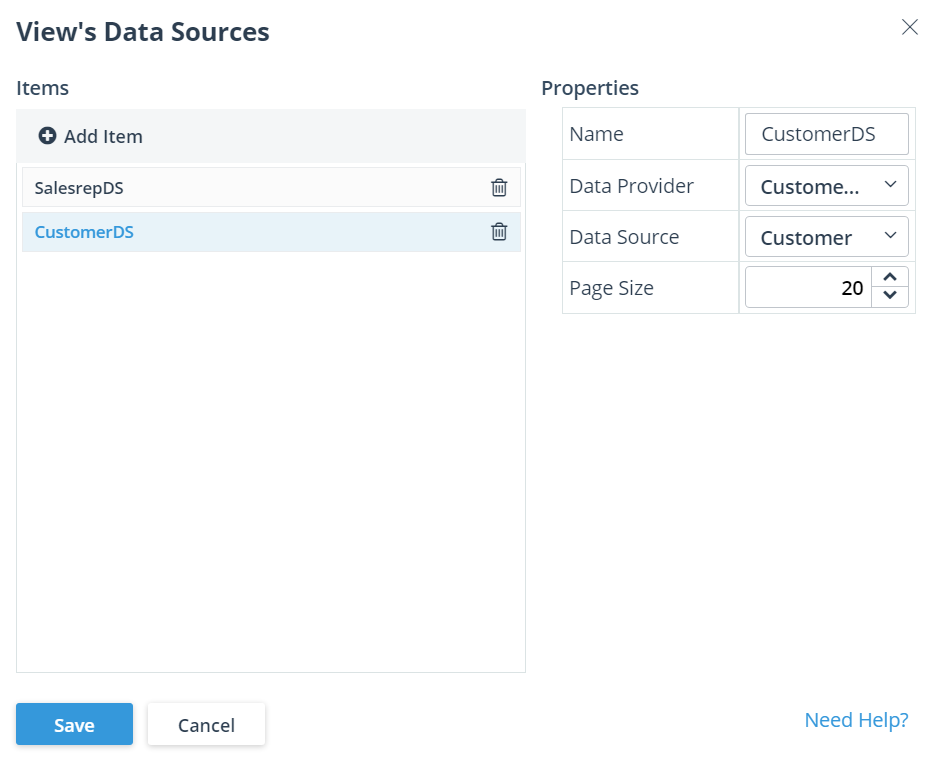
 drop-down menu for each view (as shown for the example customer_view view listed in the VIEWS pane), then clicking the Edit option. Note also that the default behavior for general event functions has no functional effect. You must add custom code to each event handler function in order to implement any useful behavior for it. Typically, you do not need to change the default names of the general event handler functions. However, the view properties exist to allow this name change if you have the need (for example, to avoid a naming conflict with existing JavaScript code you are using elsewhere in the app). For more information on coding general event handler functions (and changing their names in the source), see General view events in this document. An example of custom coding for the general onShow event function appears in the sample Table 4, which is described later in this section.COMPONENT PROPERTIES pane (in panel on the right) — Contains all the properties that you can set for the single layout or content component you currently have selected in the view design panel. (Property settings are available only for components you have added to the view.) In the customer_view view, for example (see Figure 37), the first Col component is selected in the first row, with its two groups of properties shown as follows:Screen widths — Properties that you can set to specify the number of slots of horizontal screen space for a given device and orientation. A setting for the Tablet Landscape property is required, because this value is used by default for any other device and orientation properties you do not set for the column. Note also that for reliable layout management, the total number of slots set for all columns in the same row cannot exceed 12. For more information, see the description of the view design panel, above.Hide on — Check-box properties that you can select to hide the column on a given device and orientation.
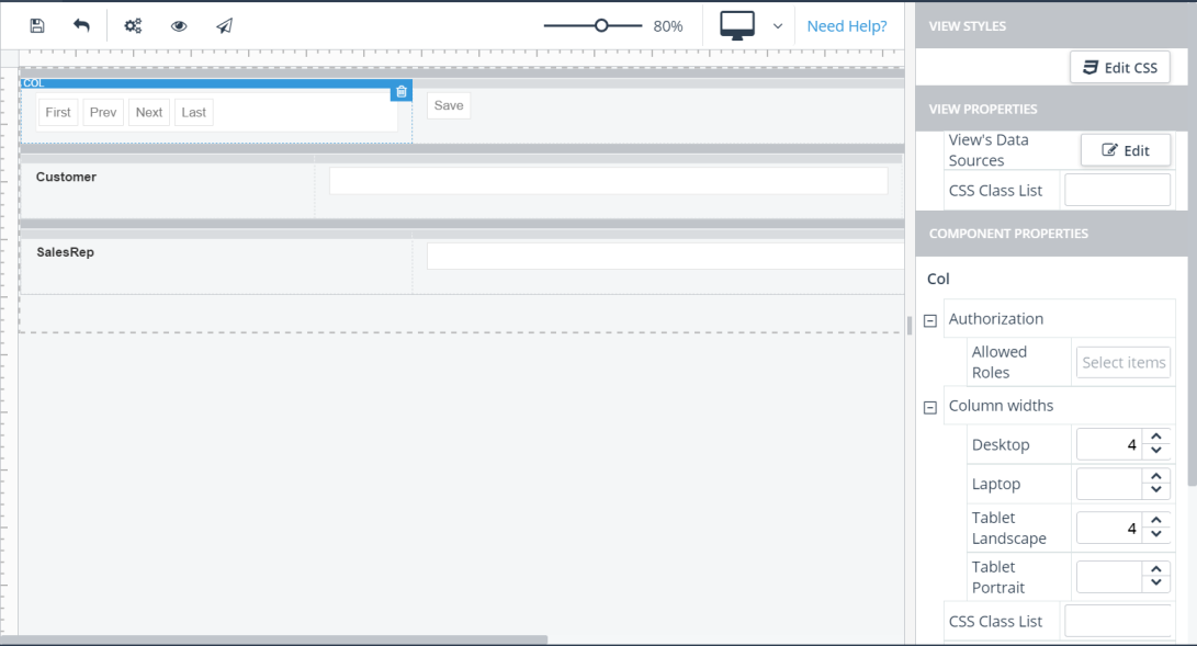 Id — The value toolbar0, which you can use to reference the Toolbar instance in event function code. (The Designer provides a default value to uniquely identify every content component in a view.)Toolbar Items — A dialog box that appears when Edit is clicked containing properties to define the toolbar navigation items displayed to the user, as shown:
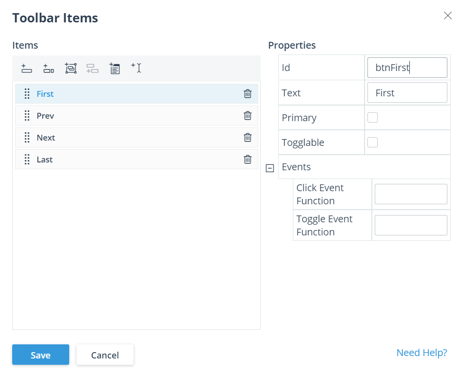 Button, similar to the example itemsSplit buttonButton groupButton you can add to any split button or button group you have defined by selecting an existing split button or button group, then clicking the +-icon for adding the buttonButton based on a templateSeparator to organize the toolbar items you are addingResizable — Selected in the example, this allows the toolbar to move items into a drop-down list if resizing its container hides some of its items.Events — Including:Click Event Function — Set to onClickToolbar, a JavaScript function that you define to execute when the user clicks a toolbar item. This function is where you can reference the ID values you have set for this component to implement its behavior. A sample implementation for this event function appears later in this section.Toggle Event Function — A JavaScript function that you define to execute when the user clicks togglable toolbar item.
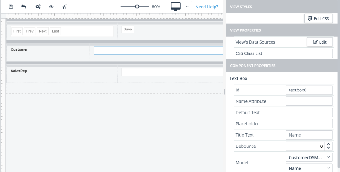 Id — The value textbox0, which you can use to reference the Text Box instance in event function code. (The Designer provides a default value to uniquely identify every content component in a view.)Title Text — The value Name, which is optional text that appears when the user hovers over the component.Debounce — (Default value: 0) The delay, in milliseconds, between user input and execution of the Change Event Function.Model — Defines the data binding for the Text Box, which includes selection of the data model name for the current Customer record (CustomerDSModel in this example) and the name of the field in the model (Name in this example) whose value you want to display and edit in the Text Box.Change Event Function — No setting in this example, a JavaScript function that you can define to execute when the user changes the value in the Text Box. This function is one place where you can reference the Id you have set for this component to implement its behavior. However, in this customer_view example, handling the change in value for this component is entirely implemented using the event function set for the Click Event Function property (onSaveClick) of the Save Button component (Id: button0). A sample implementation for this event function appears later in this section.
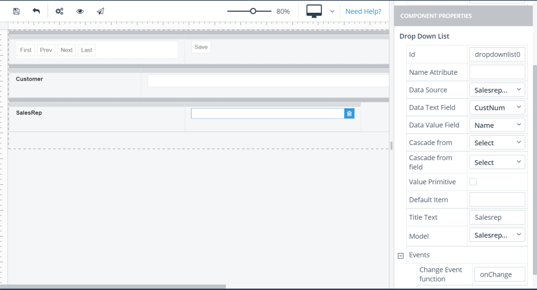 Id — The value dropdownlist0, which you can use to reference the Drop Down List instance in event function code. (The Designer provides a default value to uniquely identify every content component in a view.)Data Source Name — The value SalesrepDS, which is the data source selected from the view's data sources to set the component's data binding.Data Text Field — The value RepName, which is the name of the field selected from the specified data source both to display in the Drop Down List that corresponds to the current Customer record and to select in the Drop Down List in order to set a new value in the current Customer record.Data Value Field — The value SalesRep, which is the name of the field selected from the specified data source to use as the unique foreign key in the current Customer record to identify the SalesrepDS data source record from which to display the current Data Text Field value and to select and set a new current Data Text Field value from the available SalesrepDS data source records.Cascade from: The ID of another drop down list in the Blank view. You use this property when you want to build cascading drop down lists in the view. For example, one drop down list may display a list of product categories. When a user makes a selection, the selected category is cascaded to another drop down list, which then displays a list of products for that category. Click here to see an example of cascading drop down lists.Cascade from field: A field in the data source of the drop down list from which a selection is cascaded to the current drop down list.Value Primitive: Restricts the model to one field of the record.Default Item: The item initially displayed in the drop down list. The user can then change the selected item as needed.Title Text — The value Salesrep, which is optional text that appears when the user hovers over the component.Model — Selects the name of the data model (SalesrepDSModel in this example) used to display the current record from the SalesrepDS data source or to select a new current record from the key value specified by Data Value Field that corresponds to the value the user selects in the list specified by Data Text Field.Change Event Function — Set to onChange, a JavaScript function that you can define to execute when the user changes the value selected for the Drop Down List. This function is one place where you can reference the Id you have set for this component to implement its behavior. A sample implementation for this event function appears later in this section.
import BaseController from './controller.js' class Module1CustomerViewCtrl extends BaseController { constructor($scope, $injector, stateData) { super($scope, $injector); } // Fired when custom html section is loaded includeContentLoaded() { } // Fired when custom html section loading failed includeContentError(e) { } // Fired when view content is loaded onShow($scope) { var that = this; this.customerDS = $scope.vm.$ds.CustomerDS; this.salesrepDS = $scope.vm.$ds.SalesrepDS; this.customerModel = $scope.vm.$viewModels.CustomerDSModel; this.salesrepModel = $scope.vm.$viewModels.SalesrepDSModel; this.customerIdx = 0; this.customerDS.read().done(function(){ var data = that.customerDS.data(); that.displayCustomer(0); $scope.$apply(); }); } displayCustomer(operation){ var data = this.customerDS.data(); switch(operation) { case 0: this.customerIdx = 0; break; case -1: if (this.customerIdx) { this.customerIdx -= 1; } else { this.customerIdx = 0; } break; case 1: if (this.customerIdx === (data.length - 1)) { this.customerIdx = data.length - 1; } else { this.customerIdx += 1; } break; default: this.customerIdx = data.length - 1; } this.customerModel.id = data[this.customerIdx].id; this.customerModel.CustNum = data[this.customerIdx].CustNum; this.customerModel.Name = data[this.customerIdx].Name; this.customerModel.SalesRep = data[this.customerIdx].SalesRep; this.displaySalesrep(); } onClickToolbar(e){ switch(e.id) { case "btnFirst": this.displayCustomer(0); break; case "btnPrev": this.displayCustomer(-1); break; case "btnNext": this.displayCustomer(1); break; case "btnLast": this.displayCustomer(); break; } } displaySalesrep(e){ if (this.customerModel.SalesRep) { this.salesrepDS.filter({ field: "SalesRep", operator: "equals", value: this.customerModel.SalesRep }); var view = this.salesrepDS.view(); if (view.length) { this.salesrepModel.SalesRep = view[0].SalesRep; this.salesrepModel.RepName = view[0].RepName; } else { this.salesrepModel.SalesRep = ""; this.salesrepModel.RepName = ""; } this.salesrepDS.filter({}); if (this.salesrepModel.RepName) { angular.element("#dropdownlist0" ).data("kendoDropDownList" ).search(this.salesrepModel.RepName); } } else { angular.element("#dropdownlist0").data("kendoDropDownList").value(""); } } onChange(e){ this.customerModel.SalesRep = angular.element("#dropdownlist0" ).data("kendoDropDownList").dataItem().SalesRep; } onSaveClick(e){ var dataItem = this.customerDS.get(this.customerModel.id); var that = this; dataItem.set("Name", this.customerModel.Name); dataItem.set("SalesRep", this.customerModel.SalesRep); this.customerDS.sync().fail(function(){ that.customerDS.cancelChanges(); }); } } Module1CustomerViewCtrl.$inject = ['$scope', '$injector', 'stateData']; export default Module1CustomerViewCtrl |
// Returns a new pristine model. Use this function to set your model when // you want to insert a new item. createPristineModel: function(dataSource) { }, // Adds the model to the dataSource and returns the model. // By default, this operation updates only the local dataSource and // does not sync with the server. // If you want to immediately sync the dataSource, you need to pass // this options value: var options = { sync: true}; create: function(dataSource, model, options) { }, // Removes the model from the dataSource and returns a pristine model. // By default, this operation removes the item only from the local dataSource // and does not sync with the server. // If you want to immediately sync the dataSource, you need to pass // this options value: var options = { sync: true}; remove: function(dataSource, model, options) { return new dataSource.reader.model(); }, // Syncs the local dataSource to the server. save: function(dataSource) { dataSource.sync(); }, // Cancels all local dataSource changes, resets the dataSource to the server one, // and returns a pristine model. cancel: function (dataSource, model) { } |
removeClick: function () { this.$dsService.remove(this.$ds['CustomerDS'], this.$viewModels['CustomerDSModel']); }, cancelClick: function () { this.$viewModels['CustomerDSModel'] = this.$dsService.cancel(this.$ds['CustomerDS'], this.$viewModels['CustomerDSModel']); }, saveClick: function () { this.$dsService.save(this.$ds['CustomerDS']); }, createClick: function () { this.$viewModels['CustomerDSModel'] = this.$dsService.create(this.$ds['CustomerDS'], this.$viewModels['CustomerDSModel']); }, createModelClick: function () { this.$viewModels['CustomerDSModel'] = this.$dsService.createPristineModel(this.$ds['CustomerDS']); } |