Try OpenEdge Now
skip to main content
Online Help
Introducing the Progress Developer Studio for OpenEdge Visual Designer : Tasks : Developing a visual container : Working with UI controls : Using the Toolbox
 
Using the Toolbox
You use the Toolbox as the source of all controls that you incorporate in an OpenEdge GUI for .NET design.
By default, the Toolbox is docked to the right edge of the editing area. If you wish, you can change the docking position through the Visual Designer Preferences page.
Opening and closing Toolbox sections
Controls in the Toolbox are arranged in control groups:
To open or close a control group, click its title bar. You can also right-click and select Expand All Control Groups from the context menu. You can have multiple control groups open simultaneously.
Note: You can customize the control groups and controls that appear in the Toolbox. In particular, if you create custom controls, you need to add them to the Toolbox to make them available for use. See Customizing the Visual Designer Toolbox.
Placement mode and selection mode
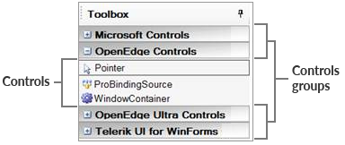
You select a control in the Toolbox by clicking its name. While a single control is selected in the Toolbox, the Visual Designer is in placement mode, meaning that it is ready to place an instance of that control on the Design Canvas. When the cursor hovers over the form in placement mode, it appears as blue crosshairs with the icon for the selected control (for example, with the ProBindingSource control selected: ). In this mode, clicking or dragging on the form results in adding a control. Note that you can also perform Toolbox customization operations while in placement mode.
To operate on the form or on controls that have already been placed on the form, you must be in selection mode. To put the Toolbox in selection mode, click the pointer tool (highlighted in the preceding illustration). When the cursor hovers over the form in selection mode, it appears as an arrow pointer . In this mode, you can select one or more objects on the Design Canvas and move them, edit their properties, or delete them.
Sticky placement mode
By default, the Toolbox automatically switches from placement mode to selection mode after you place a control on the Design Canvas. When you want to place several instances of a control in succession, you can set the Toolbox to remain in placement mode until you are ready to revert back to the default behavior.
To lock the Toolbox in placement mode, right-click a control in the Toolbox and select Make Sticky from the context menu. Repeat this process or select a different control when you want to turn off this option.
Hiding the Toolbox
By default, the Toolbox is always visible when a design is open. If you prefer to hide it when it is not needed, click the push pin icon in the top right corner. The Toolbox will then slide out of sight when it is not in use.
To display the Toolbox when it is hidden, just move the cursor over the Toolbox label in the border. The Toolbox slides back out and remains visible as long as the cursor is over it. The push pin now appears in a horizontal position; click it to pin the Toolbox in place and prevent it from hiding.