The UltraExplorerBar is a versatile control that allows you to implement a number of navigation items, styles, and groups. When you use an UltraExplorerBar, you might not need to add any additional buttons, labels, or other controls.
To add an UltraExplorerBar:
1. In the Toolbox, expand OpenEdge Ultra Controls.
2. Select UltraExplorerBar and drop it on LeftBar.
3. Select the Dock property in the Properties view. From the drop-down menu, select the middle option, Fill, which binds the control to the four borders of the form.
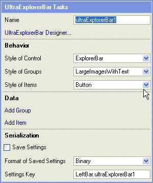
4. Click the Smart Tag arrow on ultraExplorerBar1 to display the UltraExplorerBar Tasks dialog, as shown in the following illustration:
5. Set the behavior settings listed in the following table:
Behavior setting
Value
Style of Control
ExplorerBar
Style of Groups
LargeImagesWithText
Style of Items
Button
These style properties set the general look and feel of the control, groups and items. After you complete this section, you can return to this step and experiment with other style properties.
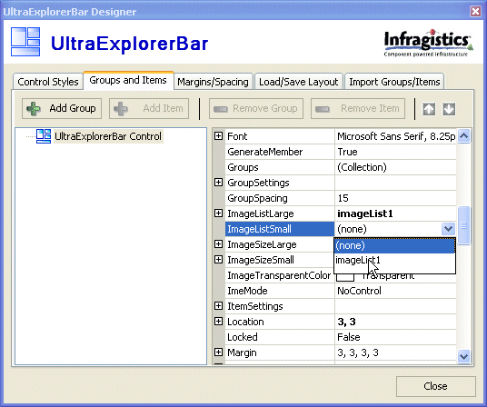
6. With ultraExplorerBar1 selected, right click and choose UltraExplorerBar Designer.
The UltraExplorerBar Designer is an interface for setting many of the properties of the UltraExplorerBar control. In this exercise you specify the source for icon images (imageList1) and you can create two functional groups (Users and Appearance). The items in each group appear as buttons, because you set the Style of Items property to Button in the last step.
7. Select the Groups and Items tab.
The Groups and Items interface appears. The root node of the element is shown in a tree view on the left. The property sheet on the right displays properties that apply to this top-level node (i.e, the element itself). Buttons at the top of the tab provide the ability to add Groups and Items.
8. Set ImageListSmall and ImageListLarge properties to imageList1, as shown in the following illustration:
This step makes the graphics files managed by imageList1 (the files located in the SampleApp/images folder) available to ultraExplorerBar1.
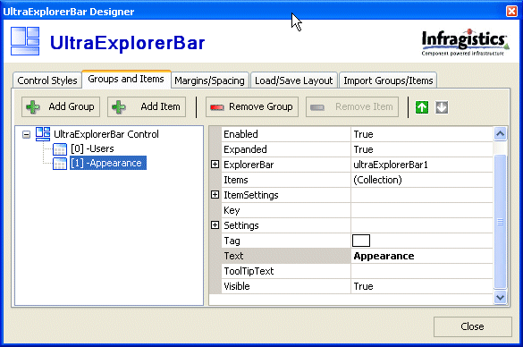
9. Click Add Group twice.
Two new groups appear in the tree view. When a group is selected, the property sheet changes to reflect the available properties for groups.
10. Rename the two new groups Users and Appearance.
To rename a group, set the Text property of the group, as shown in the following illustration:
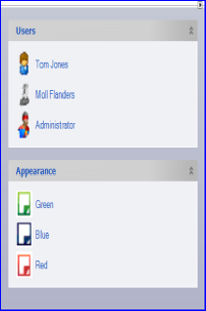
11. Select the Users group and check the Expanded property.
By default, it is set to True. This causes a group to appear in the expanded state, where all items are visible at startup. If set to False, the group appears in a collapsed state, where all items are initially hidden
12. With Users group selected, click Add Item three times.
The three items will behave like buttons (because the Item Style property was set to Button in step 5) that supply a user name and password to another user control, LoginBlock.cls.
Remember that this SampleApp is meant to show some of the capabilities of Visual Designer and .NET controls. It is not meant to be a model for real-world solutions. For example, you do not see many login dialogs where you can click a button and get valid user names and passwords. LeftBar.cls only simulates the processing of user names and passwords in order to avoid getting entangled in login and security issues.
13. Modify the Users group items by setting the properties shown in the following table:
Item
Property
Key
Text
Expand the node Settings > AppearancesLarge > Appearance > Image
Expand the node Settings > AppearancesSmall > Appearance > Image
14. Select the Appearance group and verify that the Expanded property is set to True.
The Appearance group contains buttons that change the color scheme of the windows in the sample application.
15. With Appearance group selected, click Add Item three times.
16. Modify the Appearance group items by setting the properties shown in the following table:
Item
Property
Key
Text
Settings > AppearancesLarge > Appearance > Image
[0]
styles\FlatNature.isl
Green
style_green.png
[1]
styles\TheBlues.isl
Blue
style_blue.png
[2]
styles\Red_No_pill.isl
Red
style_red.png
The value in the key field is passed as a parameter to an event handler when one of the items is selected. See Subscribing to events and adding handlers for more information. The value is a path to a style library that is used by the AppStylistRuntime control to apply a skin to the application. AppStylistRuntime is a non-visual control that is added in Adding LoginDlg.cls to the project.
At this point, LeftBar.cls should look something like the following figure.