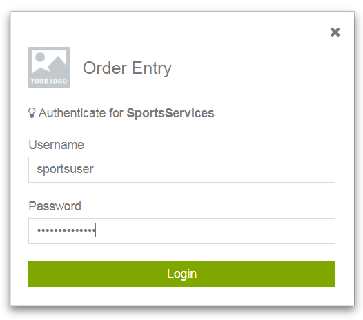
After running a web app that you create in the Kendo UI Designer, if any views you select are bound to a data provider that requires an authentication model other than Anonymous, the built-in login view in the Application module prompts the user to enter credentials, like this customized OrderEntry example:
Figure 12. Login view running in app
After entering credentials and clicking Login, the app authenticates all data providers used by the app that require authentication. The login only succeeds if all such data providers have authenticated successfully using these same entered credentials.
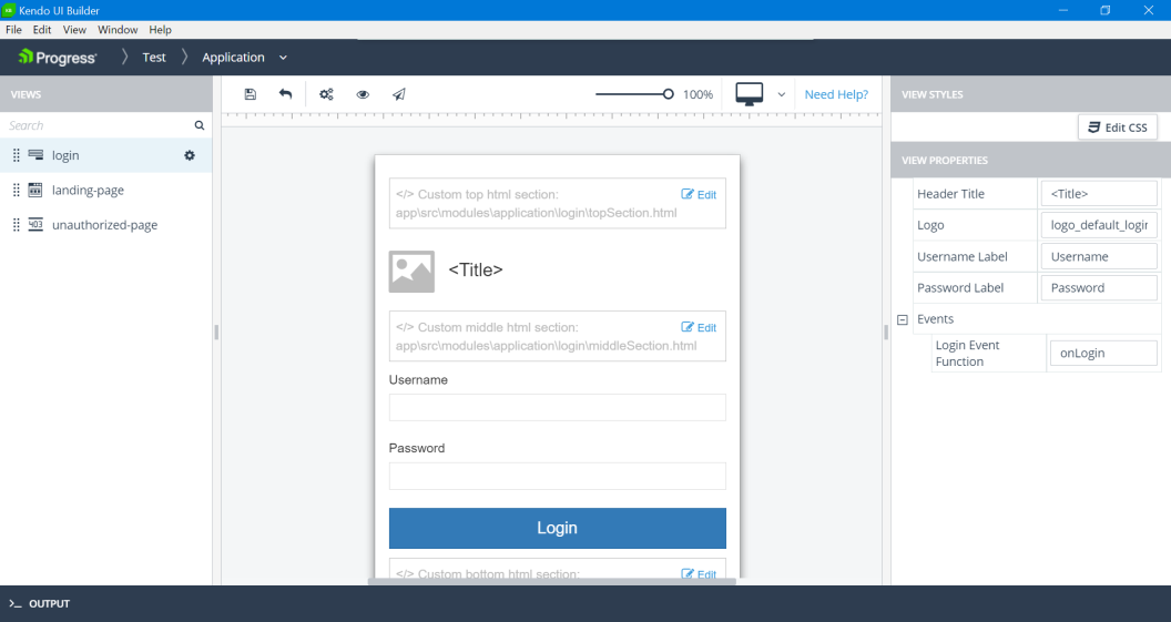
Like any view, you can customize several of its features by modifying properties in the Kendo UI Designer. To customize the login view, edit the Application module. The view design page for the built-in login view opens similar to this example (with some properties already set):
Figure 13. Login view design page
The login view design page shows certain features common to all view design pages, top-to-bottom and left-to-right:
Header — Similar to the header for the app design page, with the addition of breadcrumbs that track your path in the Designer to the current view design page.
Toolbar — Provides the following tools:
Save — Saves any unsaved changes in the current view definition to the UI meta-data.
Revert — Cancels any unsaved changes and returns the current view definition to its state as of the most recent Save.
Generate — Invokes the Kendo UI Generator to build the current state of the app ready for preview.
Preview — Either invokes the Kendo UI Generator to rebuild and preview the latest state of the app, or immediately preview the most recent generated build (if one exists). The preview opens in a tab of your default browser using a webpack-dev-server with live data from the data sources mapped to the app views.
Publish — Invokes the Kendo UI Generator to build a deployment version of the app either for testing (Debug) or production (Release) in their own respective locations. For more information on app builds, see App generation and deployment.
— Selects a device whose view you want to simulate in the view design page and which resembles the view as displayed on the physical device at run time. The displayed icon reflects the selected device from these supported devices: Desktop (default), Laptop, Tablet landscape, or Tablet portrait.
The run-time preview that you open from the Designer using Preview always displays according to the physical device where you are running the Designer.
VIEWS pane (in panel on the left) — Lists the views in the current module, which for the Application module include the built-in login and landing-page views.
Note: For a user-created module, there is also an Add button for creating additional user-created views, as shown in following topics.
View design panel (in the middle) — Shows a design simulation of the view, bounded on the left and top with a vertical and horizontal ruler. The view design panel contains the following elements that are common to both the built-in login and predefined views, but which might contain different content for each view type:
Custom top html section — Initially not implemented, this custom section appears in the view when you code the content of an HTML <div> element that displays at the top of the view.
Header section — In this case, an identifying title for the view (Header Title property) set to OrderEntry and a graphic image file (Logo property) set to the default, logo_default.png.
In the running example of this login view (shown above), no Logo image seems to appear because the graphic in the logo_default.png file is white in order to stand out in the black page header of the running web app (see App layout and components).
Custom middle html section — Initially not implemented, this custom section appears in the view when you code the content of an HTML <div> element that displays in the middle, between the header and data sections of the view.
Data section — A form containing username and password input fields with labels (Username Label and Password Label settings) that you can customize, and a Login button that the user must press to authenticate and login to the data provider bound to the selected view.
Custom bottom html section — Initially not implemented, this custom section appears in the view when you code the content of an HTML <div> element that displays at the bottom of the view.
For more information on coding custom HTML sections, see Custom HTML sections in this document.
Note: The landing-page view has only two custom sections, Custom top html section and Custom bottom html section, as the middle is populated with the icons for whatever modules are created for the app.
The design simulation in a view design panel changes as you modify some of the view properties that affect its appearance. For example, the login view title is set to OrderEntry using the Header Title property (see the VIEW PROPERTIES pane, described further as follows).
VIEW PROPERTIES pane (in panel on the right) — Contains all the properties that you can set that change the design-time appearance and content of the view, as well as some settings that can affect view behavior, such as view-specific event handler settings.
Additional properties of note include:
Edit CSS — Enables you to add and edit CSS styles for the view. clicking the Edit CSS button opens the view's style.css file in a Monaco editor. The style.cssfile is located in application-folder\app\src\modules\module-folder\view-folder, where application-folder is the path to the folder that contains and is named for your web app, module-folder is the name of the folder defining the module, and view-folder is the name of the folder defining the view.
To apply CSS classes (defined in the style.css file) to the view, you must specify the class names in the CSS Class List property in the VIEW PROPERTIES pane.
Events — Provides one or more properties to change the default name of the event handler function defined for each login view-specific event:
Login Event Function — Default value: onLogin. Executes for the Login event, which fires when the Login button is pressed.
You can also use properties in the Edit View dialog box to change the default names of event handler functions for general events that apply to all views. You can access this dialog by clicking the drop-down menu for each view (as shown for the example login view listed in the VIEWS pane), then clicking the Edit option.
Caution: You must ensure that any change to the default name of an event handler function that you make using its view property you also make to the name of the actual JavaScript function in source code.
You must add custom code to each view event handler function in order to implement any useful behavior for it. The default behavior of these functions has no functional effect. Typically, you do not need to change the default names of event handler functions. However, the view properties exist to allow this name change if you have the need (for example, to avoid a naming conflict with existing JavaScript code you are using elsewhere in the app). For more information on coding both view-specific and general event handler functions (and changing their names in the source), see General view events and View-specific events in this document.
 Header — Similar to the header for the app design page, with the addition of breadcrumbs that track your path in the Designer to the current view design page.
 — Selects a device whose view you want to simulate in the view design page and which resembles the view as displayed on the physical device at run time. The displayed icon reflects the selected device from these supported devices: Desktop (default), Laptop, Tablet landscape, or Tablet portrait.
 drop-down menu for each view (as shown for the example login view listed in the VIEWS pane), then clicking the Edit option.