|
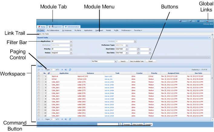
Screen Areas
|
Contents
|
|
Module Tab
|
Features related to specific module are grouped under Module Tab. Each Module Tab has its Module Menu.
|
|
Module Menu
|
Features related to specific module are listed under Module Tab as Module Menu.
|
|
Global Links
|
These links located in the top right corner of every page that are available at all times during the session.
|
|
Link Trail
|
Link Trail shows the pages you navigated through to reach the current page. You can also click any link in the link trail and go back to that page.
|
|
Workspace
|
Data is displayed in the Workspace. Data is either displayed as Forms or List.
|
|
Paging Control
|
The Paging Control is located immediately above and below the list, and allows navigation through the pages of the current list.
|
|
Filter Bar
|
This bar provides settings for filters so that the screen clutter is reduced and only the relevant data is displayed.
|
|
Search Bar
|
Search Bar allows specifying text to locate it in the list.
|
|
Command Button
|
The commands that help you interact with the data are represented by Command Buttons.
|