From the Grid Columns dialog, you can change several properties of the columns:
You can use the Include All and Exclude All buttons to move the entire list of fields from the grid data source back and forth between Included Columns and Excluded Columns lists. You can also drag and drop individual fields back and forth between the column lists by grabbing the vertical drag bars to the left of each field item. The order that the fields appear in the Included Columns list is the default order that will be used for the grid columns, so drag and drop the included fields into the order you prefer.
When you select a particular field in the Included Columns list, you can view or set the following properties:
Field Name: Read-only name of the selected field in the list.
Label: A column label that you can change from the default, which is the Label set for the selected field in the view data source.
Enable HTML Encoding: When checked, any HTML coding included in the field is applied. For example, with HTML coding enabled, a field containing "<strong>Jane</strong>" appears as "Jane" instead of normal text with the tags visible.
Format: This can be used to customize how the field is presented. Use the argument {0} to represent the content of the column. You can also add additional text to be displayed. For example, if a column holds a numeric value measured in kilograms, {0} kg appends " kg" to every field in the column. You can also add specifiers to control the format of the field. If a field is a date value, you can specify that a column display dates in long form, e.g., Wednesday, October 3, 1997, using this syntax:
Width: Initial width, measured in pixels, of the column. Leaving this value empty allows the column width to be responsive as needed.
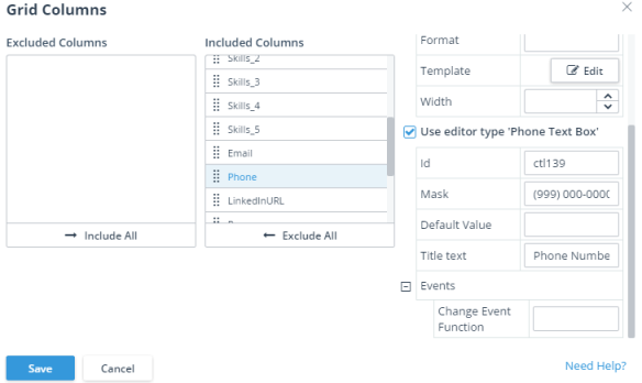
Use editor type <editor name>: Enables you to set a semantic type editor for the field. Kendo UI Designer assigns a default editor for every field based on the field's base data type or ABL data type. For instance, for a phone number field, Kendo UI Designer assigns a text box editor by default. However, you can choose a semantic type editor instead by selecting this checkbox, which enables you to configure a few additional properties for the field. In the case of the phone number field, for example, you could use these properties to constrain users to enter values in a phone number format as shown here:
The properties that are available for you to configure in a semantic type editor depends on the field's base data type, ABL data type, or semantic type (if the field has been defined as a semantic type in OpenEdge).
To know more about semantic type editors, see .
To know more about the properties available for each semantic type editor, see the table in Editing form fields.
The following options are also available for the Grid component in the Blank view:
Enable Sorting: Provides the app user with the ability to reorder rows by ascending or descending value in a given column.
Enable Filtering: Provides the app user with the ability to filter the displayed information based on content, including filters for numeric values (e.g., is equal to, is not equal to) and text fields (e.g., starts with, does not contain, etc.).
 You can use the Include All and Exclude All buttons to move the entire list of fields from the grid data source back and forth between Included Columns and Excluded Columns lists. You can also drag and drop individual fields back and forth between the column lists by grabbing the vertical drag bars to the left of each field item. The order that the fields appear in the Included Columns list is the default order that will be used for the grid columns, so drag and drop the included fields into the order you prefer.