In this section, you will add buttons to a panel. A panel is similar to a group box. Like the UltraGroupBox control, the Panel control is a container that allows you to group a number of controls together. Unlike the UltraGroupBox, the Panel control does not have a border or a label. Also note that the controls contained in a panel do not inherit a style from the panel.
There are two sets of buttons: four for navigation and four for database CRUD (create, read, update, and delete) activities.
To add buttons to the purchaseOrderForm:
1. With purchaseOrderForm.cls open in the Visual Designer, open the Microsoft control group in the Toolbox.
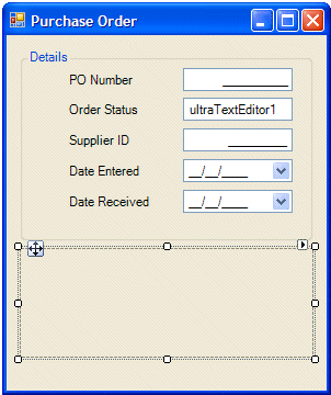
2. Select Panel, then drag and drop it below the Details section of the Purchase Order form as shown in the following illustration:
3. Expand OpenEdge Ultra Controls in the Toolbox.
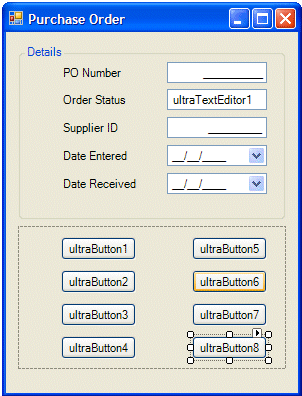
4. Drag and drop eight UltraButtons on the panel container.
You can create two vertical rows with four buttons in each row. Then you can use the tools under the Design menu to adjust the alignment and spacing of the buttons with respect to each other and with respect to the panel container. The Design menu is on the main menu bar and is also available from the context menu when you right-click on a selected control.
After you complete this step, the Purchase Order form should look something like the following:
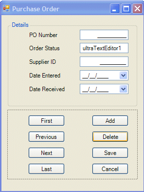
5. Set the properties of the buttons as specified in the following table.
Note: In most of the procedures in this book, the default names for controls are acceptable. For the buttons, however, you must change the Name property for the event handler code to work.
Table 2. Name and Text properties of Purchase Order buttons
Default Name
Name property
Text property
ultraButton1
btnFirst
First
ultraButton2
btnPrev
Previous
ultraButton3
btnNext
Next
ultraButton4
btnLast
Last
ultraButton5
btnAdd
Add
ultraButton6
btnDelete
Delete
ultraButton7
btnSave
Save
ultraButton8
btnCancel
Cancel
You can set these properties on the Smart Tag panel for each button. Notice the Smart Tag has a field Button Style, where you can experiment with the style of the buttons.
When you complete the steps in this section, the graphical elements of the Purchase Order form are in place. The result in the Visual Designer should be similar to the following figure.