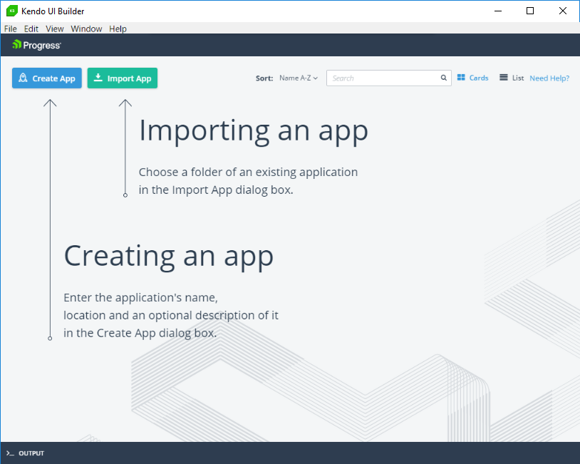
When you first start the Kendo UI Builder, it opens the Kendo UI Designer dashboard similar to this:
Figure 4. Kendo UI Designer dashboard
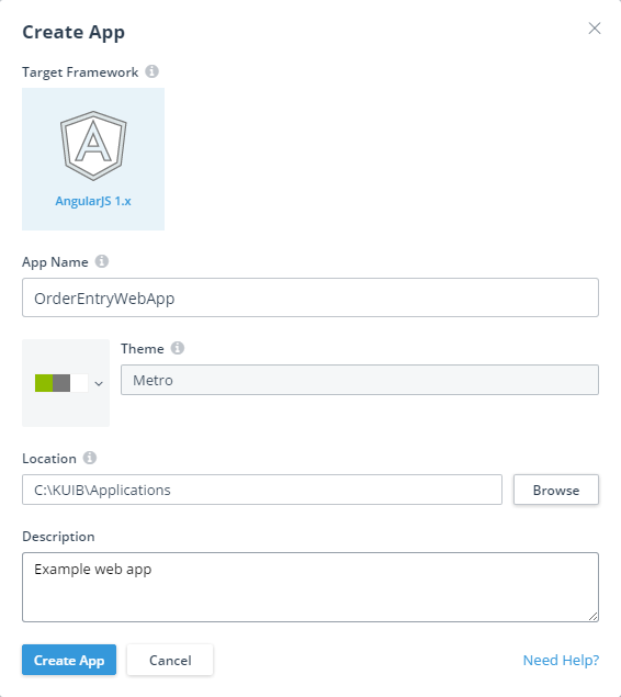
To create an app, click Create App as described on the page. This takes you to the Create App dialog box to create a web app, as in this example:
Figure 5. Create App dialog box
A read-only logo identifies the Target Framework for the app (only AngularJS 1.x is supported in this release). The value you choose for App Name becomes the name of the folder where your app is created. The Theme selector allows you to select a color scheme for the app from among several built-in options. The Location value is the path name of the folder where the app folder is to be created. You can optionally enter a Description, which appears along with the App Name on the dashboard after you create the web app.
If you want your app development testing and production deployment to be managed from within a Web UI project of Progress Developer Studio for OpenEdge, specify App Name with the same name as the Web UI project, and specify Location as the pathname of the folder path name where you create the project as shown in the example. This Location can be either within the Developer Studio workspace or in any other location accessible to Developer Studio. Note also that you can create the Web UI project in Developer Studio to manage the web app either before or after you have created and built the app in the Kendo UI Designer as long as both the project and app names and locations for both Developer Studio and the Designer are the same.
After filling in the fields, you can create the app by clicking the Create App button, which opens the app design page, where you can design, build, and preview the app, as shown later in this topic.
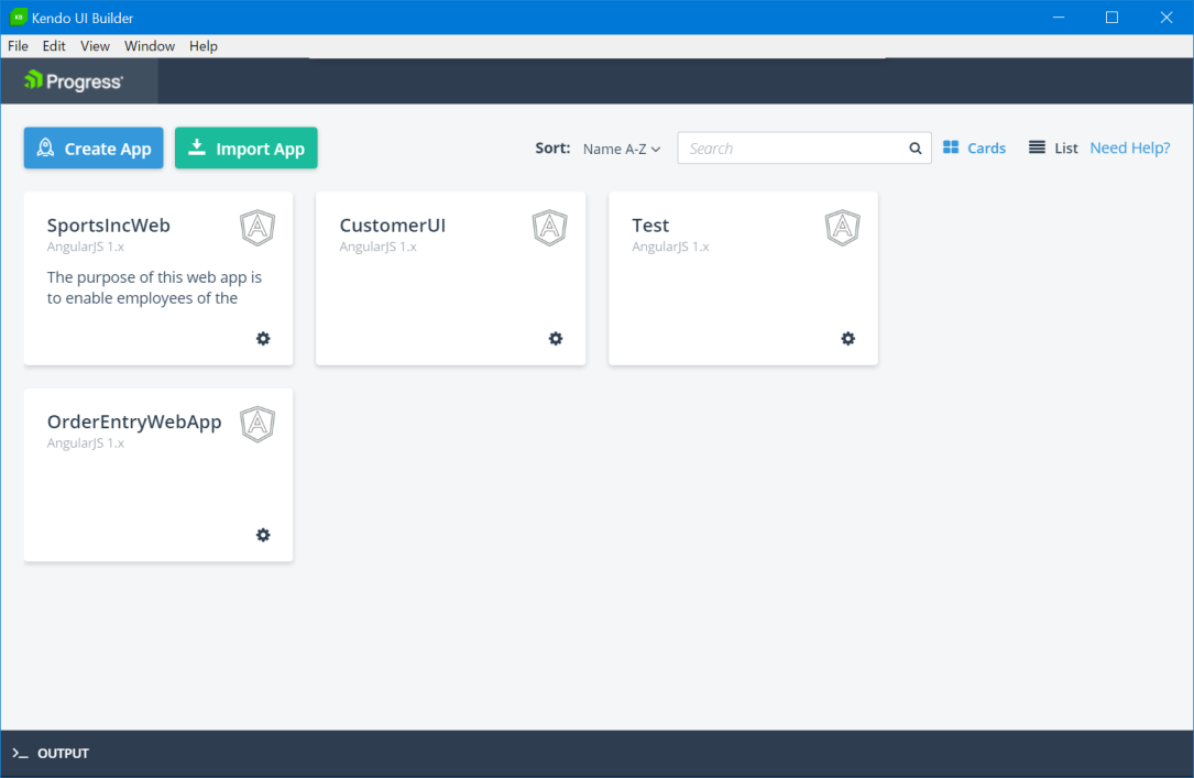
When at any point after creating the app you return to the Kendo UI Designer dashboard by clicking the Progress logo in the header, a card or list item is displayed for the app by selecting Cards (the default) or List in the toolbar of the page.
This is an example card for the OrderEntryWebApp app, as created in the previous Create App example:
Figure 6. Dashboard with created app card
Note that if you are upgrading from an earlier build or version of Kendo UI Builder, the first time you open the Designer, it attempts to automatically import apps that you had on the dashboard of your previous version, displaying their app cards and an indication of the status of their import. You can also explicitly import external apps not currently on the dashboard by clicking Import App, which adds the app card and a similar indication of the import status.
Clicking the gear control on the app card (or list item), provides several options, depending on any import status. Possible options include Duplicate (create a copy of the app with a different name and/or location), Migrate (migrate the meta data if an import was successful and migration is required), Remove (remove the app from the dashboard, leaving its file structure intact), and Delete (delete the app, including its file structure, from the Designer and from any Web UI project you have created for it in Progress Developer Studio for OpenEdge).
Note that to help locate one of many apps you might create, you can sort the apps or search for a given app card or list item using Sort or the search box, respectively. Note also, anywhere in the Designer where you see Need Help?, you can click to open a help topic for that page or dialog box in the Designer.
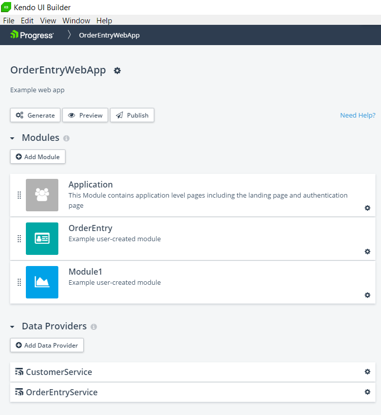
At this point, you can click the app card or list item to return to the app design page, which might appear similar to this example for OrderEntryWebApp showing app development already in progress:
The Output bar at the bottom displays logging information. Clicking the bar opens a console that displays log messages that are useful when you need to debug or troubleshoot a problem. The Eraser shaped icon on the left hand corner clears the console viewer and the X icon closes the console viewer.
Figure 7. App design page
The app design page is where all design, build, and preview activities are initiated for an app. This particular example shows some components of our OrderEntryWebApp, including modules and data providers, already designed to some extent.
The app design page contains the following elements, from top to bottom:
Header — Similar to the header for the Kendo UI Designer dashboard, with the addition of breadcrumbs that track your path in the Designer. In the example, the design page is displayed at the top-level of its parent app.
App Title — The name you gave the app when you created it (in this case, OrderEntryWebApp), followed by a gear menu. The menu provides the following options:
Properties: This opens the Edit App dialog box, where you can change the following app property settings:
Theme: To change the theme of your app, click the color-coded button and choose from a list of available themes. If you want to create your own custom theme, click the Go to Kendo UI ThemeBuilder link. This opens a tool called the Progress Sass ThemeBuilder which enables you to create custom themes. To import a custom theme, click Import ThemeBuilder Theme to import the CSS file for each custom theme you want to add to the list. Select the desired theme and click Apply to save your changes.
App Logo: The logo that appears in the header of the app main (landing) page.
Language Label: The default language label for the generated application.
Language Culture: The default language culture for the generated application. The language culture defines the number, date and time formats, etc, in the generated application. To know more about setting language cultures see Localizing the generated app.
Description: The description of the app for your own reference (not visible to the app user). This text appears both on the app card or list item on the dashboard and below the app title on the app design page.
You cannot change the App Name or its Location after you have created the app.
Roles: This opens an Authorization Roles dialog box that allows you to define the names of user roles that the app can use to authorize access to modules, views, and one or more layout components of a Blank view. You can then specify one or more of these user roles as part of the definition for each module and view, and for specific rows and columns of a Blank view layout. If an authenticated user is authorized for a given role, they are granted access to any module, view, or Blank view layout component that is also defined with that role. To know more about using roles, see Using roles to authorize user access.
Below this App Title is any description you enter for the app, either when you first create it or using this Edit App dialog box.
Toolbar — Provides the following tools:
Generate — Invokes the Kendo UI Generator to build the current state of the app ready for preview.
Preview — Either invokes the Kendo UI Generator to rebuild and preview the latest state of the app, or immediately preview the most recent generated build (if one exists). The preview opens in a tab of your default browser using a webpack-dev-server with live data from the data sources mapped to the app views.
Publish — Invokes the Kendo UI Generator to build a deployment version of the app either for testing (Debug) or production (Release) in their own respective locations.
Modules — A module is basically a container for one or more views. Every app is initially created with a built-in Application module that contains built-in views, as shown in the example. You can also create user-created modules that contain user-created views by clicking Add Module. In the example, two user-created modules are created, OrderEntry and Module1.
You can edit some identifying features of every created module by clicking its pencil control. You can add or edit the definitions of user-created views in a user-created module by clicking its Edit control, and you can delete a user-created module (with confirmation) by clicking its trash control. You can also rearrange the order of modules on the app design page by dragging and dropping them. For user-created modules, this also changes their order of appearance on both the landing page and views page at run time.
The built-in Application module can never be deleted and is created with the following built-in views, which also can never be deleted:
login — Prompts the user for credentials and authenticates access to data providers that require it. This view only appears in the app at run time if one or more data providers require access using an authentication model other than Anonymous. For more information, see Data providers and data sources.
landing-page — This is the first view to open for an app, and provides a page displaying a labeled icon for every user-created module in the app. You can then select any icon to continue app execution with the selected module (see App layout and components).
Note: At run time, the Application module itself never appears in the web app. Only its built-in views appear in he app according to how you define its user-created modules and views. The Application module serves only as a design-time container for these built-in views.
Data Providers — Data providers define data services and their data sources for binding data to views. Each data provider can define one data service, the authentication model required to access that data service, and one or more data sources from that data service. Each data source represents a single table from its data service. You can create a new data provider by clicking Add Data Provider. In the example, two data providers are created, CustomerService and OrderEntryService.
You can define data sources for a data provider either when you first create the data provider or by clicking its Edit control after you create it, which also allows you to change other properties of the data provider definition. You can delete a data provider (with confirmation) by clicking its trash control.
Using the controls on this page, you can create and update most components of a web app, except those that require extension point and source code customization, such as event handlers and custom CSS classes. Most of the remaining topics provide more information on working with these components. For more information on code customization for a web app, see Extension Points and Source Code Customization.
 Header — Similar to the header for the Kendo UI Designer dashboard, with the addition of breadcrumbs that track your path in the Designer. In the example, the design page is displayed at the top-level of its parent app.